Remembering Michael Turner: The Legacy of Aspen Comics’ Visionary Artist
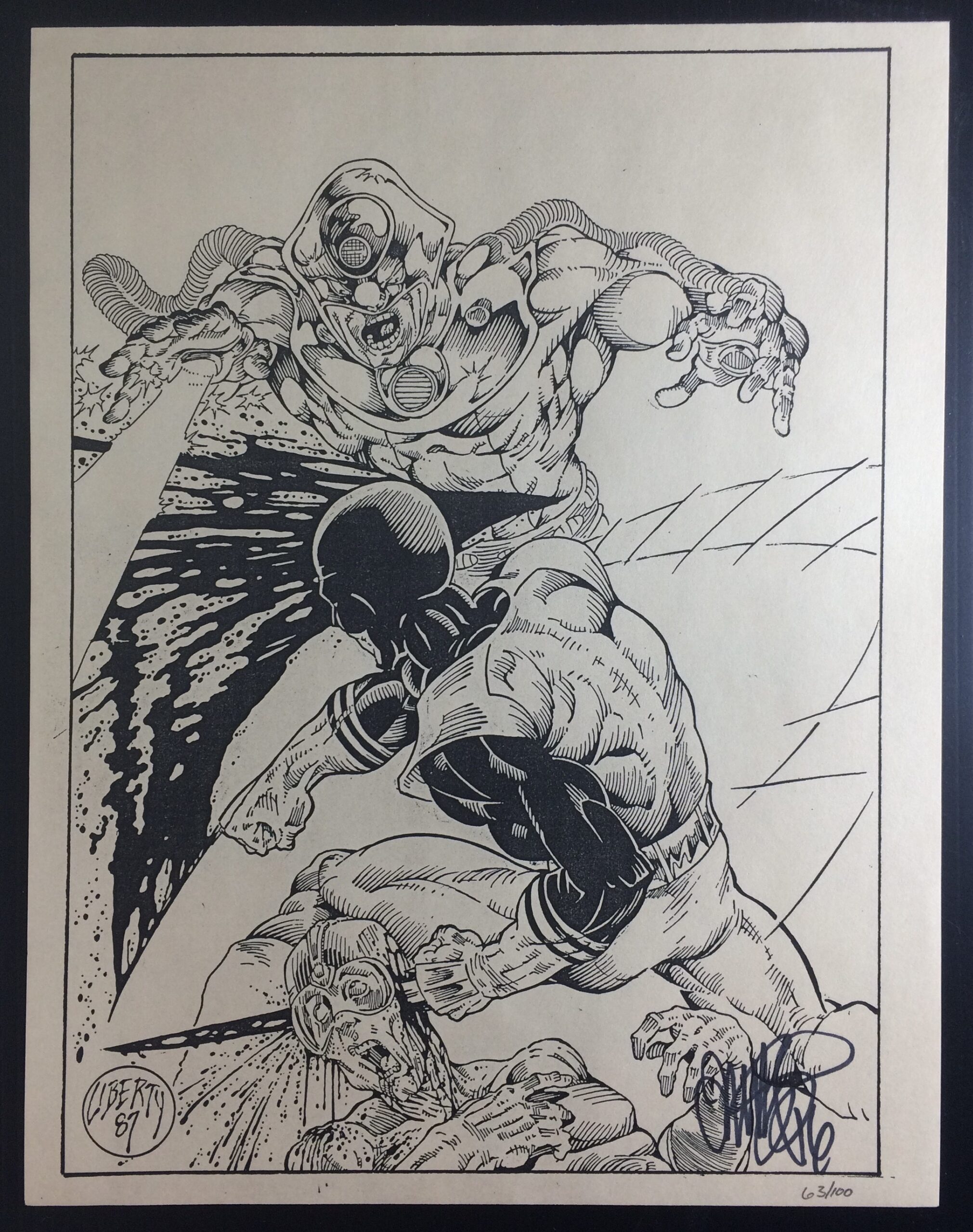
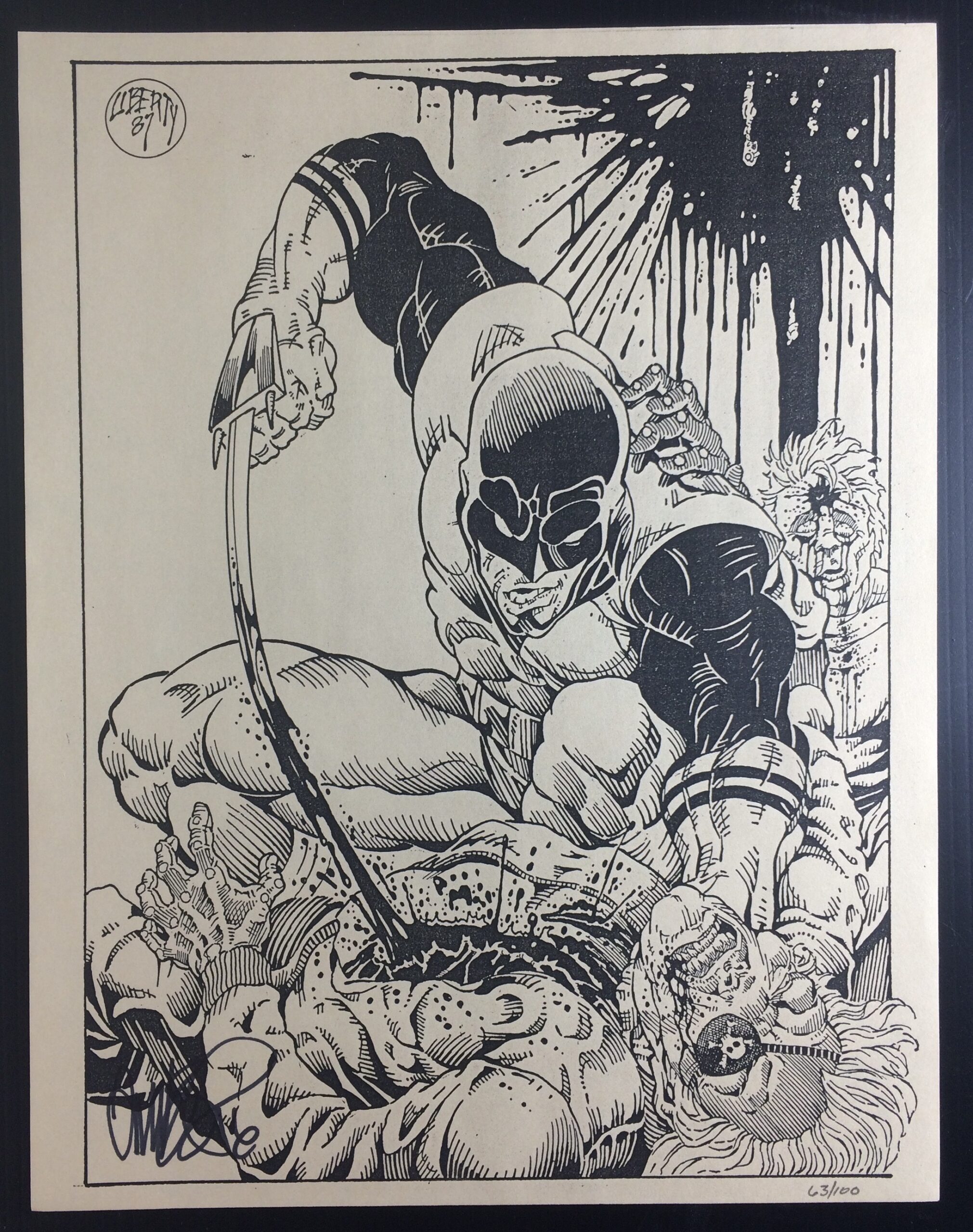
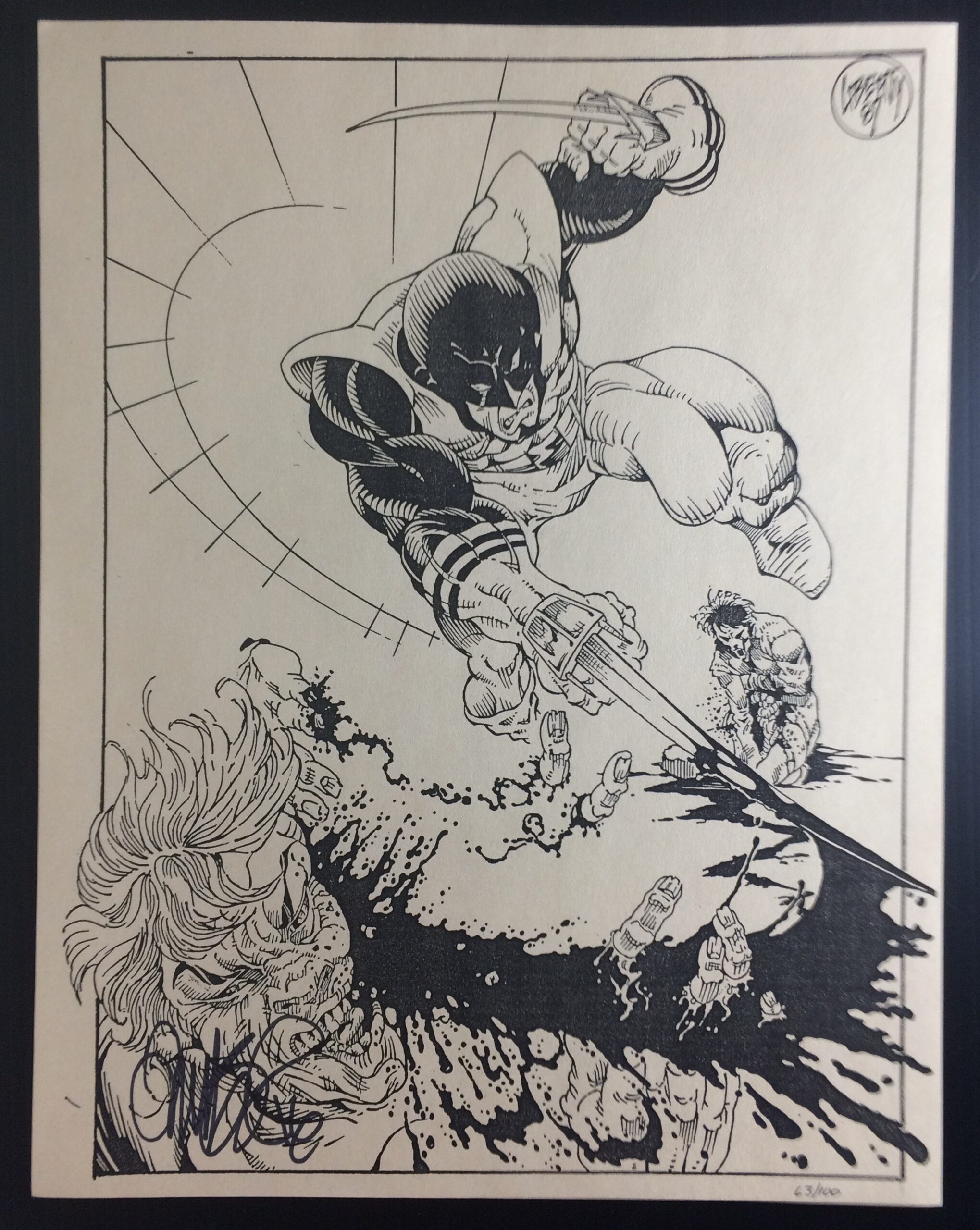
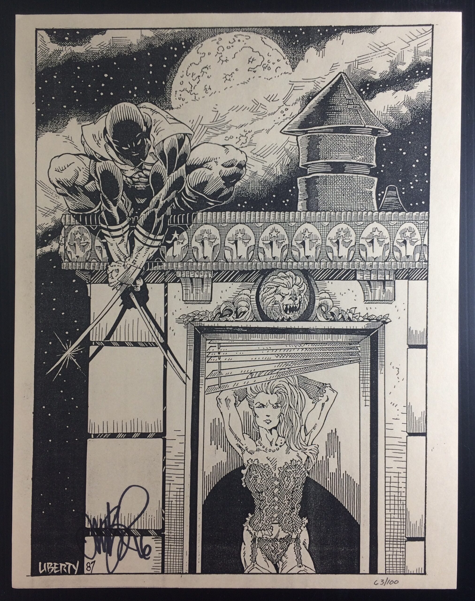
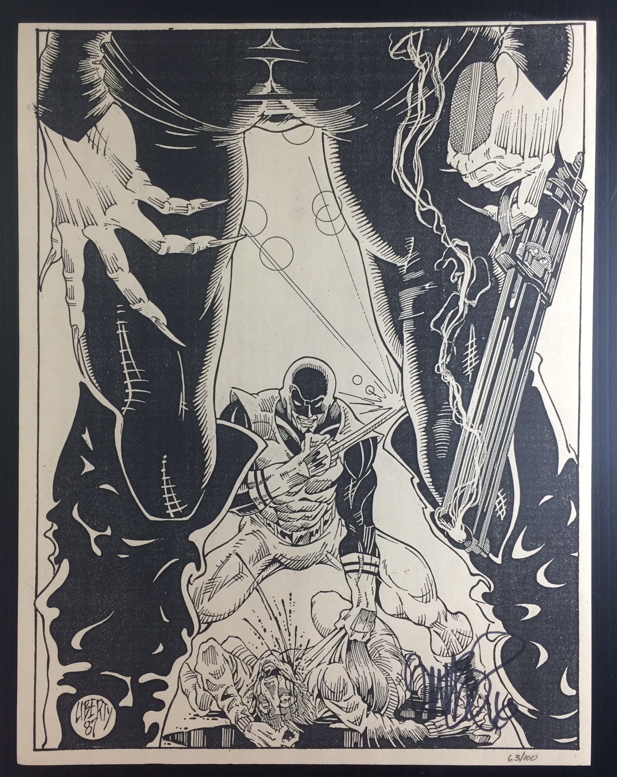
I’ve been thinking recently about Michael Turner; I’ve been collecting comics for 40 years, and during that time, there have only been a handful of artists that truly stand apart. When you see their pencil work, it’s immediately clear — they’re operating on another level. Michael Turner was one of those rare artists who didn’t need an inker or colorist to elevate his work; his raw pencils were already perfection.
From Wikipedia:
“In March 2000, Turner was diagnosed with chondrosarcoma, a form of cancer, in the right pelvis. He was treated at the Ronald Reagan Center with surgery in which he lost a hip, 40% of his pelvis, and three pounds of bone. The surgery was followed by nine months of radiation therapy.”
In this century, very few artists have reached “rock star” status. Legends like Todd McFarlane, Jim Lee, Greg Capullo, and Adam Hughes remain industry kings after decades of work, while modern greats such as David Finch, Jerome Opeña, Adi Granov, and Gabriele Dell’Otto have carried that artistic torch. Even among that group, however, few can match Turner’s ability to blend incredible detail with dynamic, sensual character design. Turner was also unique in that he was a regular artist for interiors, not just covers.
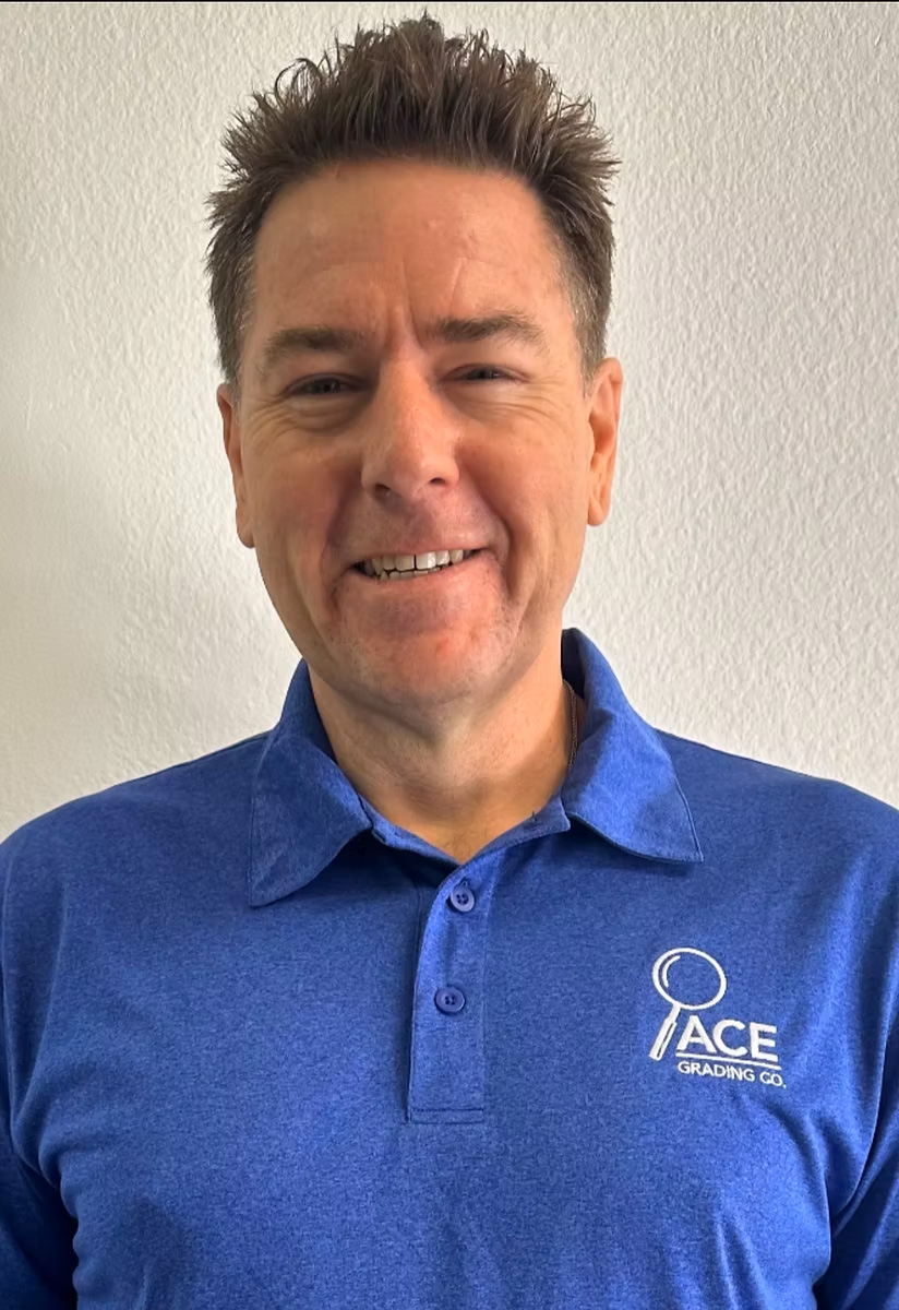
I was fortunate to be gifted a copy of Shrugged #1 Wizard Philadelphia Variant (Aspen, July 2006), signed by Michael Turner on June 3, 2006. At the time, I was working in the CGC grading room when lead modern grader Sean Caffrey asked if anyone wanted a signed copy. I was the only one who did, and I was had it authenticated and encapsulated.
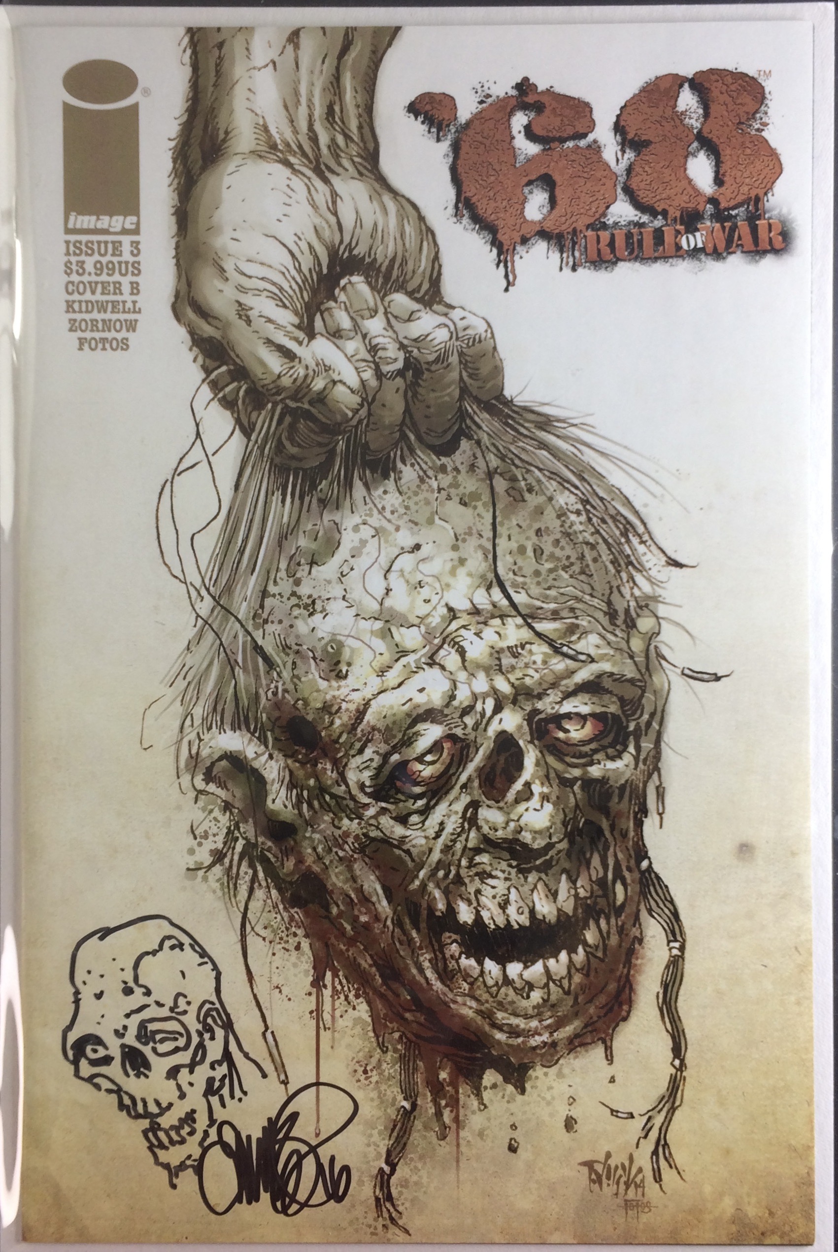
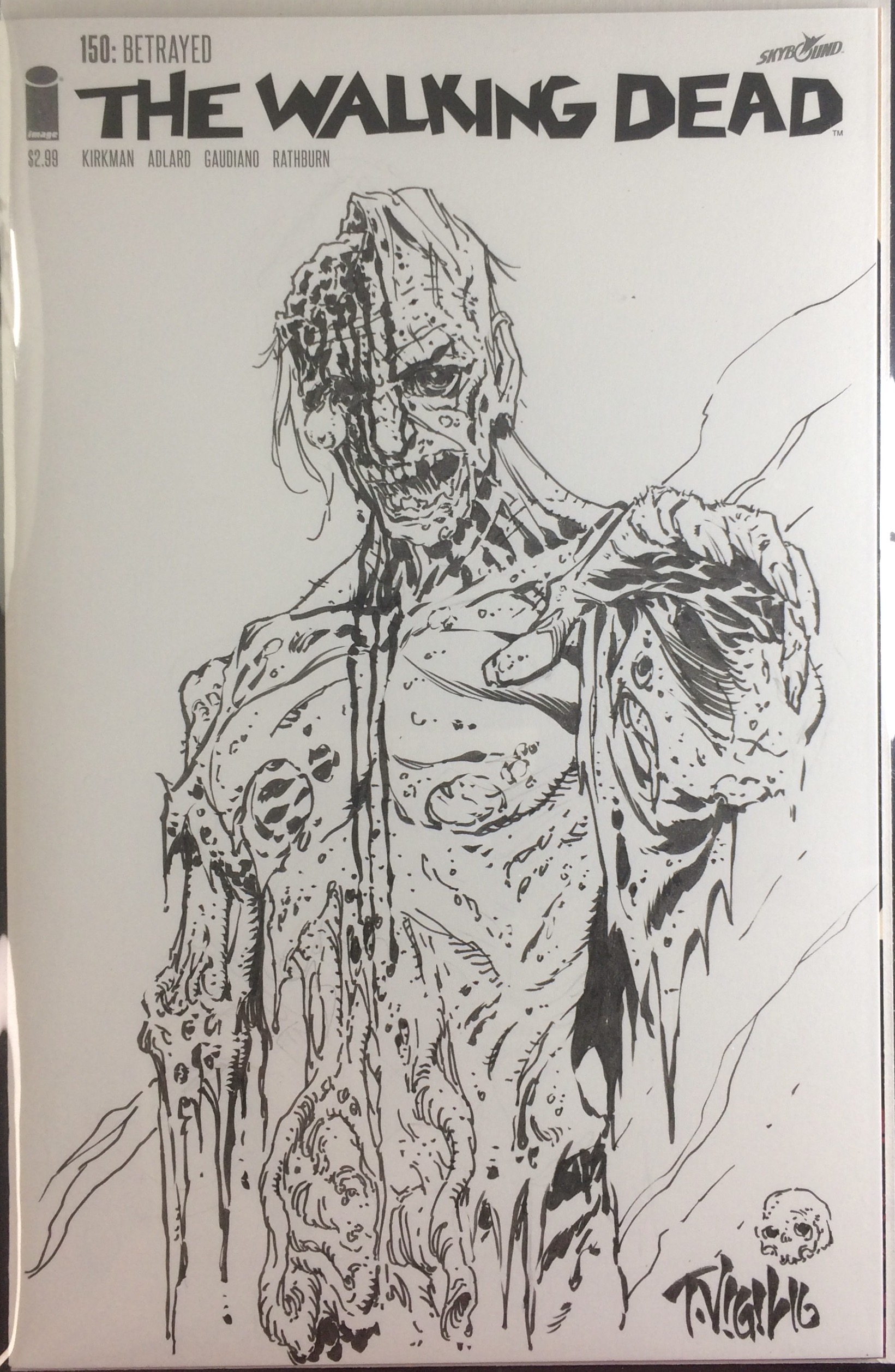
There aren’t many signed and witnessed Turner signatures with confirmed dates out there. About a decade ago, his art saw a resurgence thanks to Aspen’s variant covers for Batman, Spider-Man, and Black Cat. I own two examples — Civil War #3 and Ms. Marvel #1 Sketch Variant Editions — both of which I picked up at The Source Comics and Games in Falcon Heights, Minnesota, around 2007. Seeing those covers in person was a revelation. No inks, no colors — just pure, unfiltered pencil work. It doesn’t get any better than that.
In the two decades since his passing, few artists have come close to capturing that same magic. Maybe Jorge Jiménez, though he’s hardly a newcomer. I keep waiting for the next great young artist to blow us away with a fresh, hand-drawn style that isn’t dominated by digital techniques.
Michael Turner was one of the last truly great modern pencilers. His work remains a benchmark of artistry, passion, and authenticity.
Writing this post reminded me of just how precious life is. Michael Turner passed away 17 years ago, in 2008. Looking at his Wikipedia page — at that small “dash” between his birth and death dates — I felt a deep sadness for his family, friends, and fans. Turner was only a year older than I am; he died at just 37 years old. Today, he would have been 54.
Thank you, Michael, for your incredible contributions to the industry — and for staying true to yourself. That’s never easy.
Rest in peace.
Rob Pillsbury